Why do people donate money to politicians and political parties? Sometimes it's because they agree with the platform, but sometimes it might be for potential financial benefits. When it comes to large donations from Fortune 500 companies, I suspect the latter!
And since politics has been in the news a lot lately, here's a photo from my friend Eva about news. She saw this sign in front of a general store in a little fishing village in southeast Australia. Now that you're in a good mood, let's jump into the analytics...

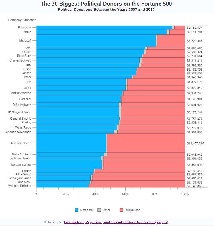
I recently saw an interesting article that shed some light on political contributions. I encourage you to read the article for more background info - they explain several things such as "Keep in mind that these contributions are coming from employees who work at these companies, not the corporations themselves. It’s actually illegal for corporations to make contributions directly to candidates." But what really caught my attention in the article was their graph:
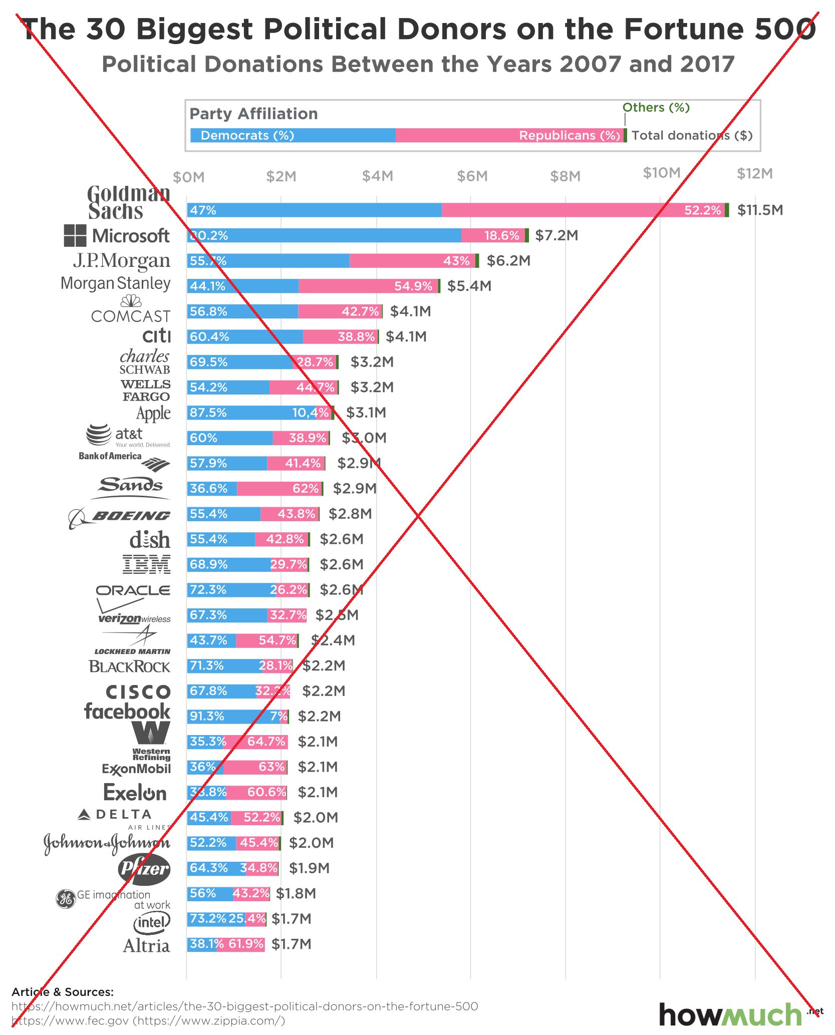
It was an interesting graph, but I had a few complaints about it...
- The graph appears very cluttered.
- They tried to show too many things in one chart.
- The company logos used to label the bars are not consistently shaped, therefore it's difficult to tell which company goes with which bar.
- Using a stacked bar, it's sometimes difficult to determine whether the blue segment or red segment is longer.
- With both bar segments labeled, and a label at the end of each bar, (plus the % and 'M' at the end of the text) there's a lot of ink used for these text labels - perhaps that's just too much writing on the graph.
- The legend below the title confused me - at first, I thought it was an overall summary bar, rather than a color legend.
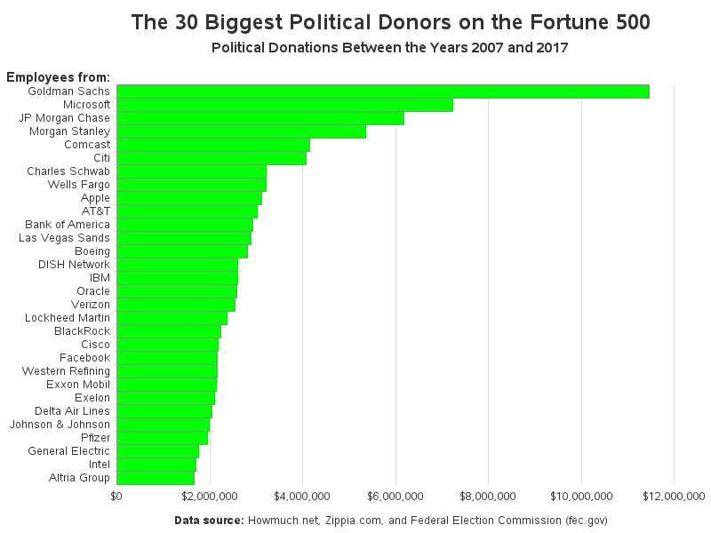
It's easy to complain and critique, but as a true Graph Guy I always try to show how a graph might be improved! So I created my own versions, using SAS Software. Rather than trying to show so many things in a single graph, I decided to use simple graphs that just showed one thing. First, a simple graph showing the total donations from employees of each company:
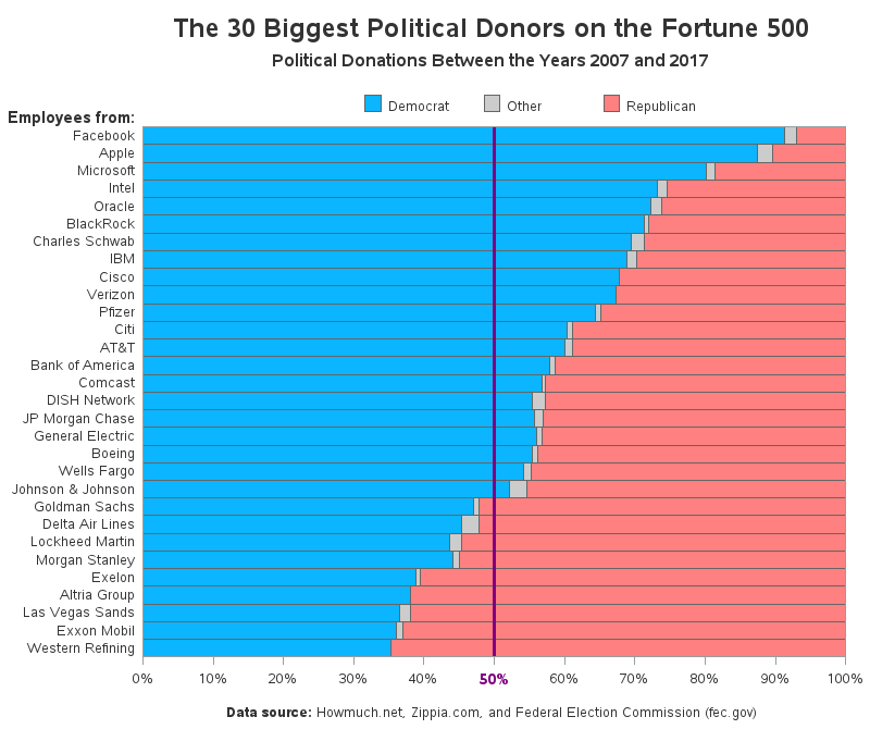
My next graph shows the percent distribution of the donations between the Democratic and Republican parties. Notice I've added a reference line at 50%, so you can easily tell if the donations were strongly biased one way or the other. Also, rather than putting the 'Other' bar segment at the end (as they did in the original graph), I placed it between the two bars.
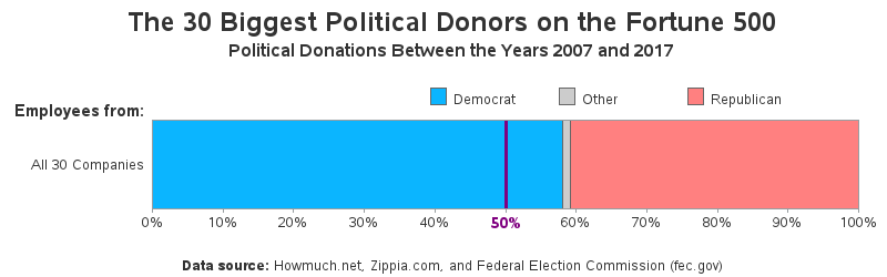
I then created an overall chart, with a single bar. This is what I had first thought the legend in the article was. With this chart, it's easy to see that Democrats received well over 1/2 of the donations.
Although I accused the original chart of trying to show too many things in one chart, what if I really did want to show both the total amount and the % split between Democratic and Republicans in one chart? Against my better judgement, I gave it a try ...
Here I use Proc Gareabar to represent the total amount of the contributions as the width of the bars, and the percent that went to Democrats and Republicans as the length of the stacked bar segments. Note that Gareabar uses ActiveX (behind the scenes), and it doesn't allow me to do things like specify the axis tick marks (so I have one at 50%), add a reference line at 50%, control the mouse-over text, include the titles and footnotes as part of the image, etc. I don't usually recommend this type of chart, but I thought it would be interesting to try it in this special case:
Did you learn anything new from these graphs? Any surprises? Which graph do you prefer? (I guess it depends on what question you might have about the data, eh?) Are there any other graphs you think would be useful? As always, feel free to discuss in the comments section! :-)

3 Comments
Very clear presentation. Thanks!
This is fascinating stuff - we don't have quite such detailed data on political party donations here in the UK plus companies are allowed to make direct donations but there is one interesting angle this data doesn't cover and that is the number of donations per employer. For example Goldman Sachs employees may contribute the most but is that made up of a few large donations or many small ones and what is the average donation size per company?
Ahh! - I don't know the answers, but those are good questions!